Lesson 7: Using Maps to Answer Questions
Students answer questions geographic data using maps, charts, population pyramids, cartograms, remote sensing, and Geographic Information Systems (GIS)
In the last lesson when you created your own map I had you color it according to population. Being a person who learns visually, it helps me to see charts and maps that give you information rather than just reading about it. And a map or a chart is a great way to present information in a way that is easier to understand.
I did not explain to you how to make a map based on population density because I wanted you to figure it out on your own. I wanted you to be creative and find a way to show which cities in your island country had the greatest population. On most population maps the darker areas signify the areas with the most people.
I did not explain to you how to make a map based on population density because I wanted you to figure it out on your own. I wanted you to be creative and find a way to show which cities in your island country had the greatest population. On most population maps the darker areas signify the areas with the most people.
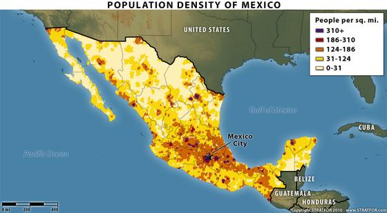
Population Density Map of Mexico
There is a key in the upper right-hand corner showing you what the colors mean. The darkest color means that more than 310 people live within a square mile. This doesn't mean that 310 people live in Mexico City. Mexico City (the capital of Mexico) is 573 square miles. But this is an old map. That is another important question to ask yourself when looking at a map, especially one that shows statistics... how old is it?
Today there are approximately 8.85 MILLION people who live in Mexico City. So what can you learn by looking at this map?
Well most of the population is near Mexico city which is pretty far from the border with the United States. In fact the area closest to the United States is the most sparsely populated. When you hear news stories and people talk about immigrants crossing the border from Mexico what do you picture? Cities emptying? If you live in Mexico City and you want to cross the border to the United States you have a long way to travel.
Let's look at some more maps that show data:
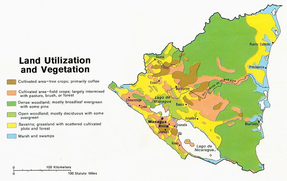
Land Usage Map of Nicaragua
The map above is a map of Nicaragua (one of the countries in Central America) and it shows you what the land in Nicaragua is used for. Maps like these help you learn more about the country. You can see on the map that there are two big areas shaded in darker green. When you look at the key it shows you that this means the areas are "dense woodland... with evergreen and pine".
This map is from 1979. Between then and now do you think there is as much area of dense forestland? If you read this article it tells you that Nicaragua lost 21% of its forests between the years of 1990 and 2005. A more modern map would probably look different.
The description of the forest mentions 'broadleaf evergreen' trees. When we think of 'evergreen' here in Utah we think of Christmas trees and pine trees. It really just means trees that stay green year round. In Nicaragua the coldest month (January) has an average temperature of 79 degrees farenheit (source here).It isn't unusual for trees to stay green there all year long. But maybe you don't picture pine trees when you picture the Central American forests of Nicaragua. Here's a picture:
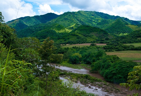
Nicaragua
If you click on the picture it will take you to a page that tells you a little more about the country of Nicaragua.
If you read the description under the title of the lesson you'll see that the state wants you to learn about GIS systems, so let's talk about that for a second. GIS stands for Geographical Information Systems. Geographical means the earth and what it looks like. So a Geographical Information System is a map of a place that gives you information. Like the population density map of Mexico we looked at... that's a GIS. Or the map of Nicaragua that showed you what type of vegetation was on the land... that's a GIS. When you have data about a place a GIS is a great way to show that data on a map.
The description also mentions 'remote sensing' which is basically a fancy way of saying 'information from far away'. Satellites take pictures of the earth, that is remote sensing. When you're taking a picture from above without touching the land, it is considered remote sensing. I mentioned satellites, they can take pictures looking at ultraviolet light like the one below, it's a picture of the earth taken from the moon:
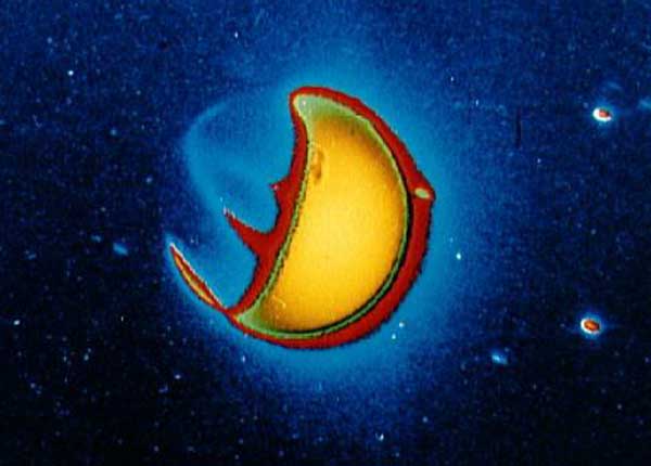
Ultraviolet picture of the Earth
Below is another interesting map. Google took information from the internet, they wanted to answer the question, what place on earth gets photographed the most? So they looked at the amount of pictures uploaded or pictures that have been viewed the most online. So this map is supposed to show the most popular and most photographed places on earth:
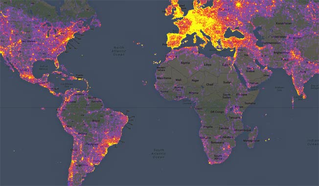
Google Heat Map
You can explore this map on this website: http://www.sightsmap.com/
Another thing the description mentioned was CARTOGRAMS. It is a map that is distorted in some way to help show data. That's a pretty simplified definition, but I think it would be easier to understand if I showed you a few pictures of Cartograms;

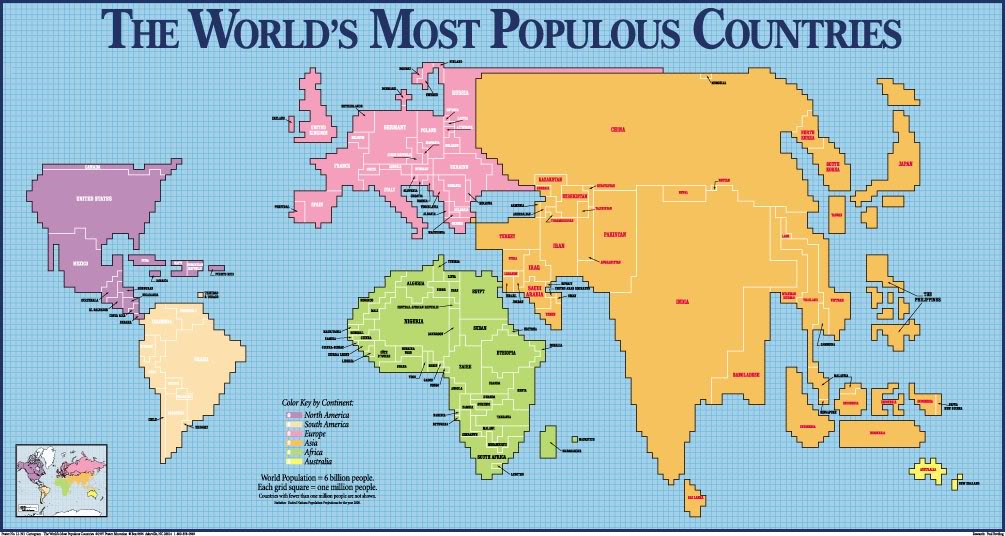
Cartograms are maps that show things besides the shape and area of a place. Here's another example of a Cartogram that completely ignores what the shape of the country is:

Green house gas emissions by country in Europe
The map above is a small piece of a world map that shows how much greenhouse gas emissions each country produces. If you click on the picture it will take you to a page where you can see the whole world map instead of just Europe like this map shows. And it will also explain more about what the numbers mean and the purpose of the map.
Assignment 7
I've showed you a little bit about how to interpret different kinds of maps... now it's your turn. Use the following maps to answer the questions listed. Make sure to answer in COMPLETE sentences.
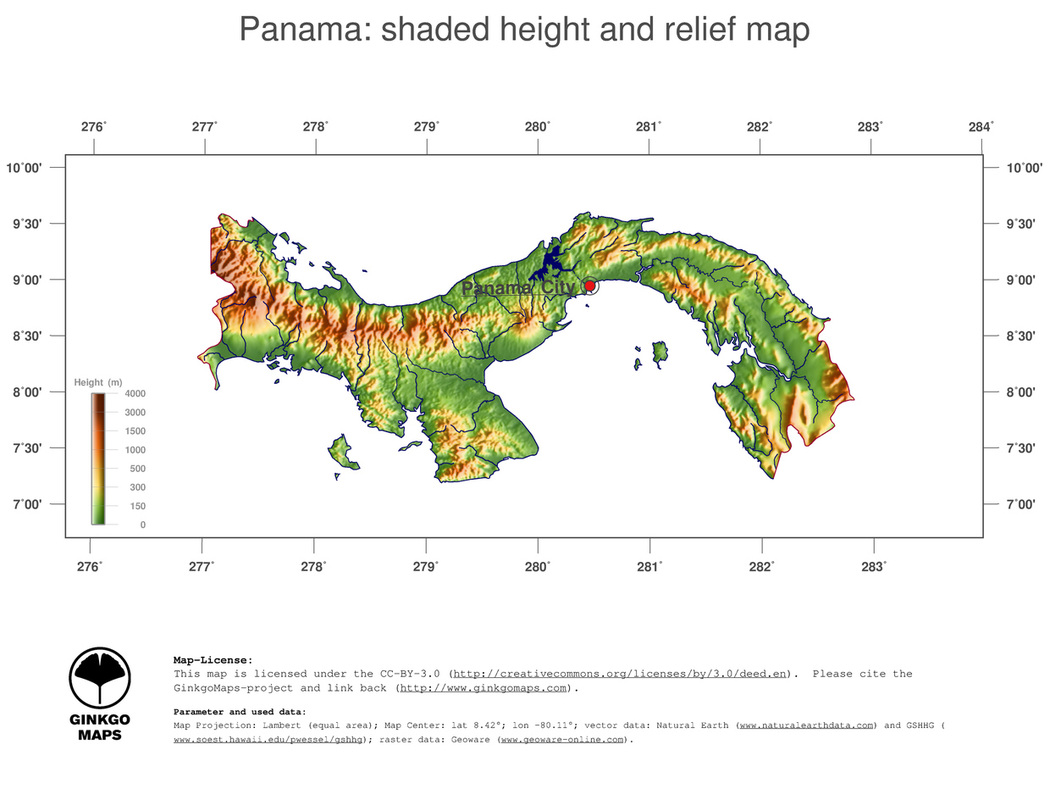
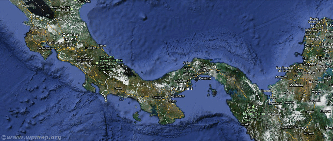
MAP 1......
Height (m) means in meters, as in meters above sea level
Questions for MAP 1
1. What are the latitude and longitude coordinates of Panama City? (remember to label N, S, E, W on your degrees)
2. What are the latitude and longitude coordinates of the highest elevation in the country of Panama?
1. What are the latitude and longitude coordinates of Panama City? (remember to label N, S, E, W on your degrees)
2. What are the latitude and longitude coordinates of the highest elevation in the country of Panama?
Map 2
Questions for MAP 2
3. What type of map is this?
4. What data is this map displaying?
3. What type of map is this?
4. What data is this map displaying?
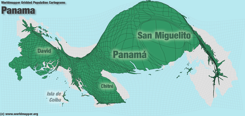
MAP 3
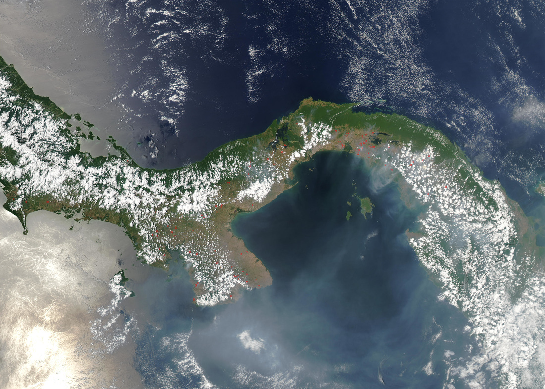
MAP 4
Questions for MAPs 3 & 4
5. What purpose could these maps be used for?
6. What technique was used to make these maps/images?
5. What purpose could these maps be used for?
6. What technique was used to make these maps/images?
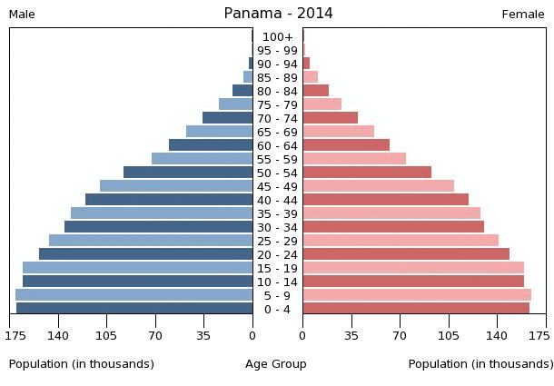
MAP / CHART 5
Questions for MAP / CHART 5
7. What does this population chart tell you about males from ages 45-49?
8. How could this chart be used? Give 3 possibilities
7. What does this population chart tell you about males from ages 45-49?
8. How could this chart be used? Give 3 possibilities
You should have 8 questions answered. Again, make sure you wrote in complete sentences. If your sentence doesn't make sense by iteself, then it is incomplete. An example of an imcomplete sentence would be "Because the region is full of mountains." to make it complete you might say "Hiking is popular in this country because the region is full of mountains".
Standard 1 Objective 1 D
